62 Variable Transformations
62.1 Rationale
In order to obtain reliable model fits and inference on linear models, the model assumptions described earlier must be satisfied.
Sometimes it is necessary to transform the response variable and/or some of the explanatory variables.
This process should involve data visualization and exploration.
62.2 Power and Log Transformations
It is often useful to explore power and log transforms of the variables, e.g., \(\log(y)\) or \(y^\lambda\) for some \(\lambda\) (and likewise \(\log(x)\) or \(x^\lambda\)).
You can read more about the Box-Cox family of power transformations.
62.3 Diamonds Data
> data("diamonds", package="ggplot2")
> head(diamonds)
# A tibble: 6 x 10
  carat cut       color clarity depth table price     x     y     z
  <dbl> <ord>     <ord> <ord>   <dbl> <dbl> <int> <dbl> <dbl> <dbl>
1 0.23  Ideal     E     SI2      61.5    55   326  3.95  3.98  2.43
2 0.21  Premium   E     SI1      59.8    61   326  3.89  3.84  2.31
3 0.23  Good      E     VS1      56.9    65   327  4.05  4.07  2.31
4 0.290 Premium   I     VS2      62.4    58   334  4.2   4.23  2.63
5 0.31  Good      J     SI2      63.3    58   335  4.34  4.35  2.75
6 0.24  Very Good J     VVS2     62.8    57   336  3.94  3.96  2.48
62.4 Nonlinear Relationship
> ggplot(data = diamonds) +
+   geom_point(mapping=aes(x=carat, y=price, color=clarity), alpha=0.3)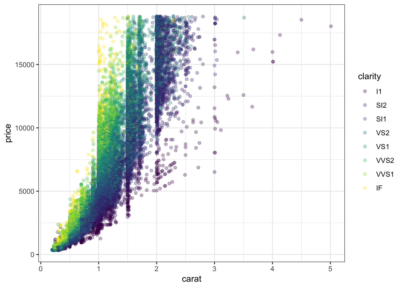
62.5 Regression with Nonlinear Relationship
> diam_fit <- lm(price ~ carat + clarity, data=diamonds)
> anova(diam_fit)
Analysis of Variance Table

Response: price
             Df     Sum Sq    Mean Sq  F value    Pr(>F)
carat         1 7.2913e+11 7.2913e+11 435639.9 < 2.2e-16 ***
clarity       7 3.9082e+10 5.5831e+09   3335.8 < 2.2e-16 ***
Residuals 53931 9.0264e+10 1.6737e+06
---
Signif. codes:  0 '***' 0.001 '**' 0.01 '*' 0.05 '.' 0.1 ' ' 1
62.6 Residual Distribution
> plot(diam_fit, which=1)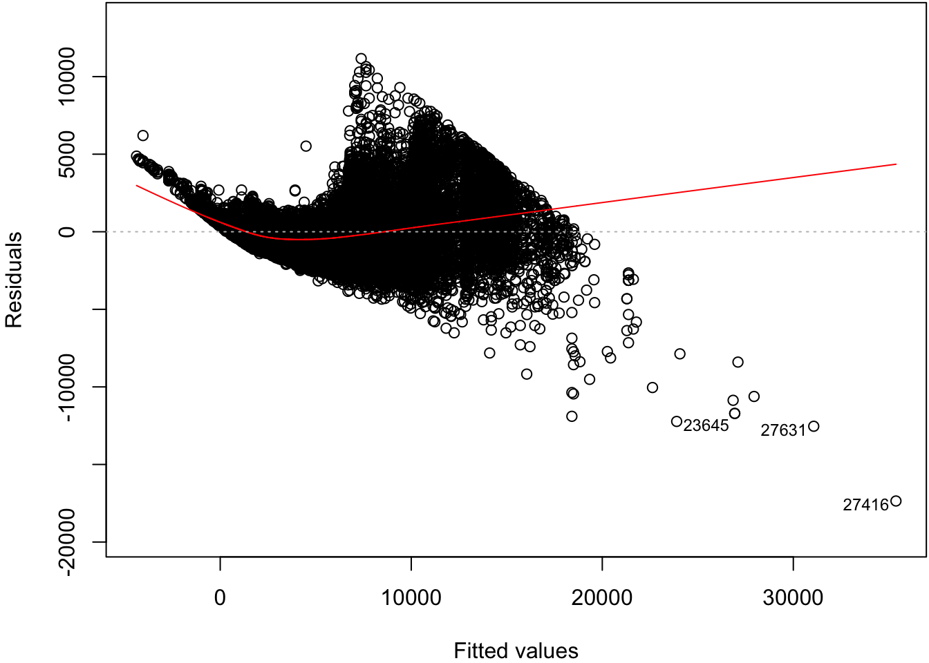
62.7 Normal Residuals Check
> plot(diam_fit, which=2)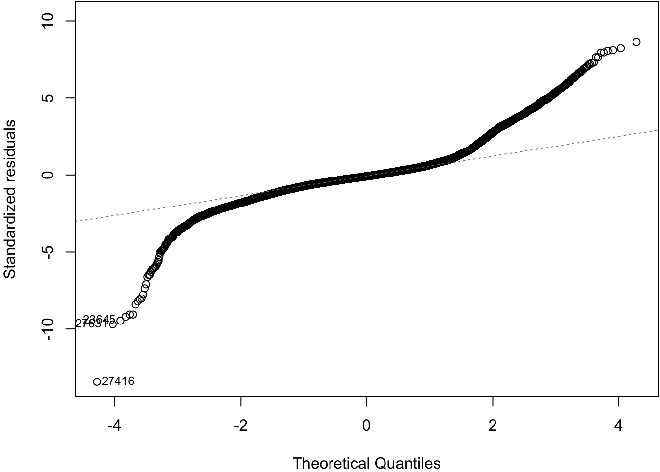
62.8 Log-Transformation
> ggplot(data = diamonds) +
+   geom_point(aes(x=carat, y=price, color=clarity), alpha=0.3) +
+   scale_y_log10(breaks=c(1000,5000,10000)) +
+   scale_x_log10(breaks=1:5)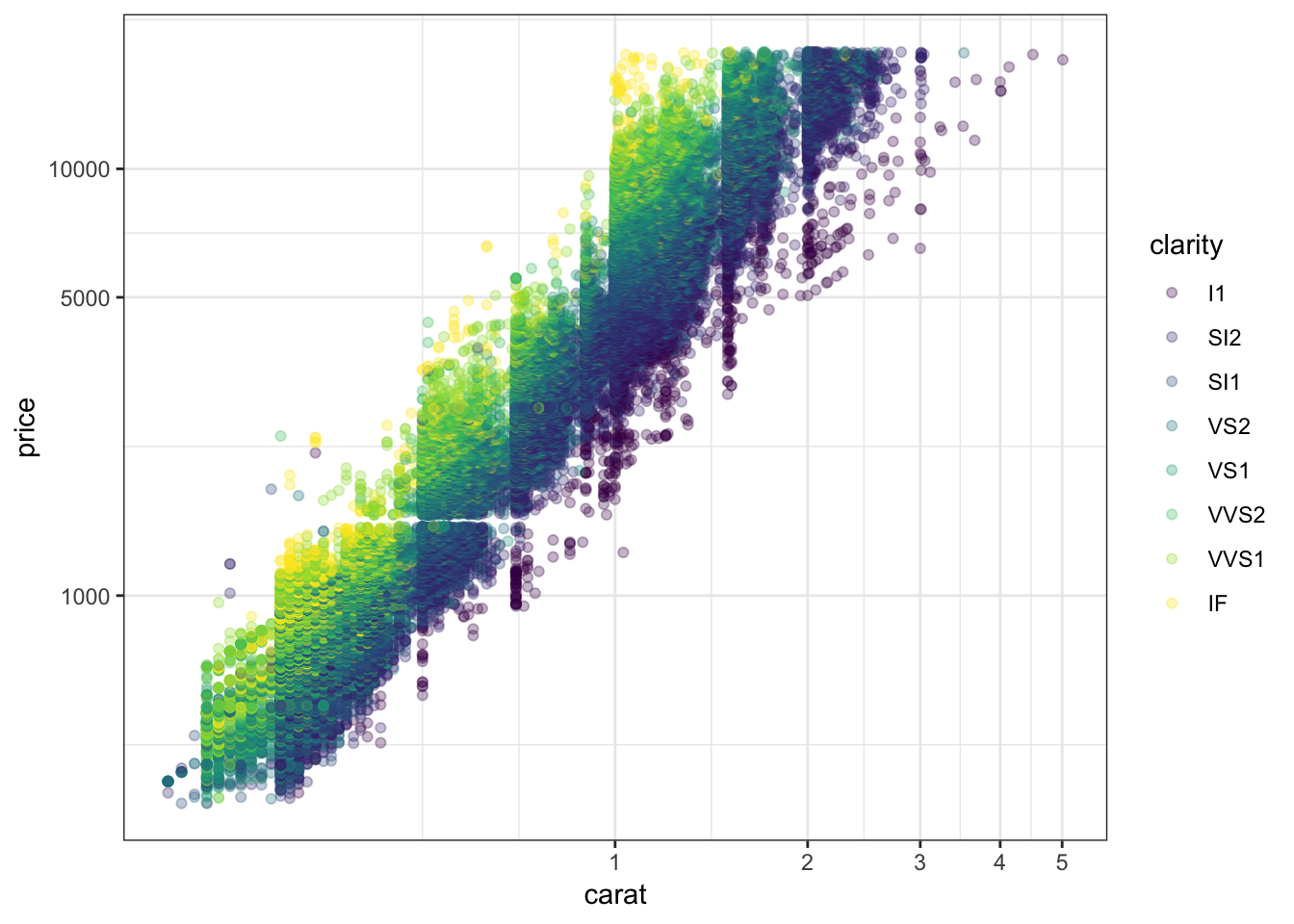
62.9 OLS on Log-Transformed Data
> diamonds <- mutate(diamonds, log_price = log(price, base=10),
+                    log_carat = log(carat, base=10))
> ldiam_fit <- lm(log_price ~ log_carat + clarity, data=diamonds)
> anova(ldiam_fit)
Analysis of Variance Table

Response: log_price
             Df Sum Sq Mean Sq   F value    Pr(>F)
log_carat     1 9771.9  9771.9 1452922.6 < 2.2e-16 ***
clarity       7  339.1    48.4    7203.3 < 2.2e-16 ***
Residuals 53931  362.7     0.0
---
Signif. codes:  0 '***' 0.001 '**' 0.01 '*' 0.05 '.' 0.1 ' ' 1
62.10 Residual Distribution
> plot(ldiam_fit, which=1)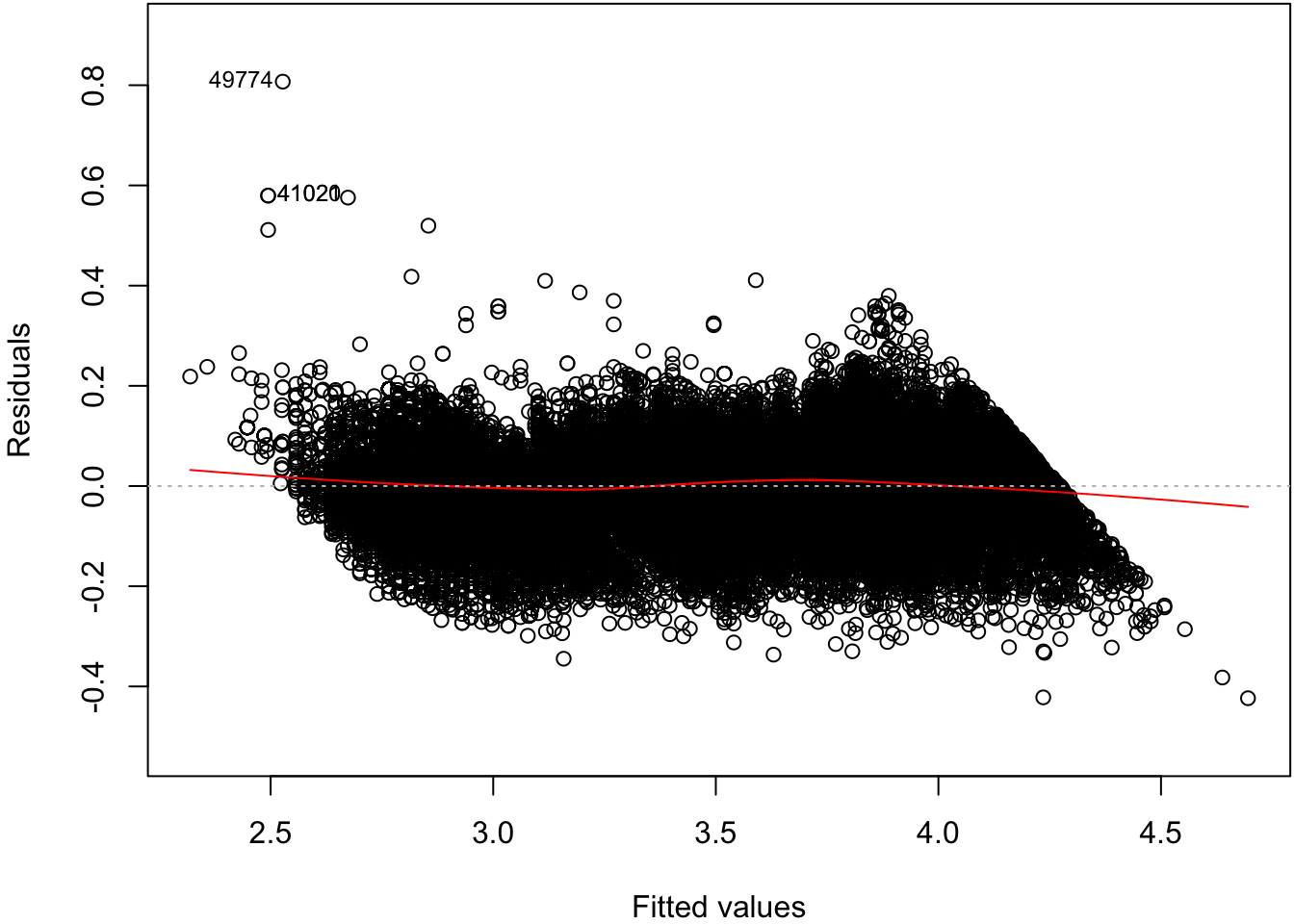
62.11 Normal Residuals Check
> plot(ldiam_fit, which=2)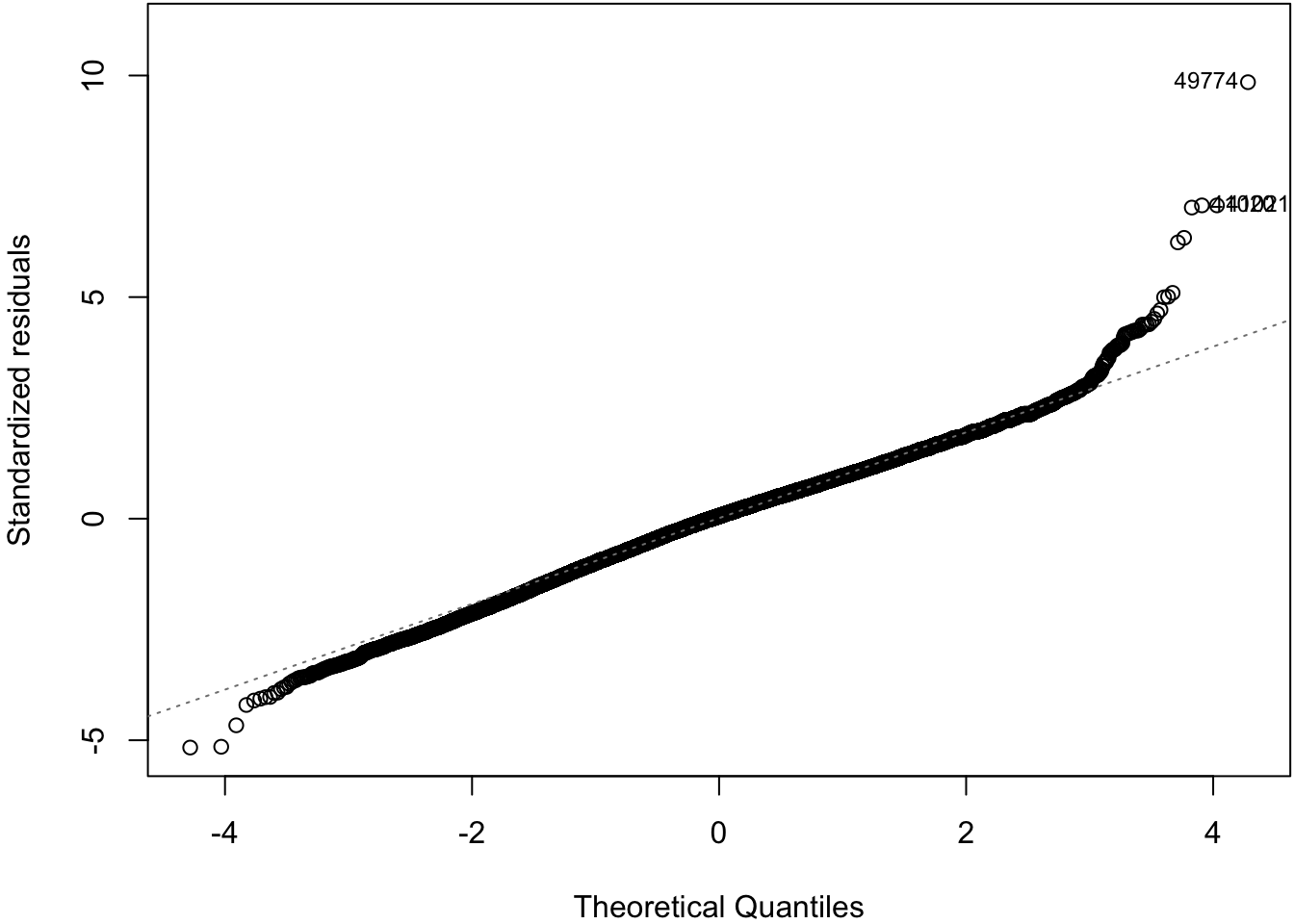
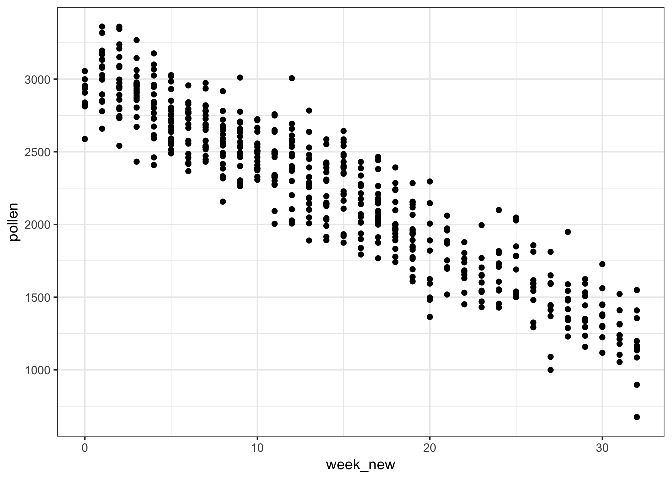
62.12 Tree Pollen Study
Suppose that we have a study where tree pollen measurements are averaged every week, and these data are recorded for 10 years. These data are simulated:
> pollen_study
# A tibble: 520 x 3
    week  year pollen
   <int> <int>  <dbl>
 1     1  2001  1842.
 2     2  2001  1966.
 3     3  2001  2381.
 4     4  2001  2141.
 5     5  2001  2210.
 6     6  2001  2585.
 7     7  2001  2392.
 8     8  2001  2105.
 9     9  2001  2278.
10    10  2001  2384.
# … with 510 more rows
62.13 Tree Pollen Count by Week
> ggplot(pollen_study) + geom_point(aes(x=week, y=pollen))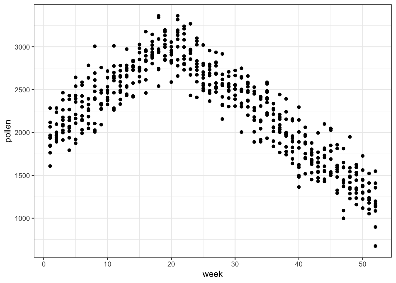
62.14 A Clever Transformation
We can see there is a linear relationship between pollen and week if we transform week to be number of weeks from the peak week.
> pollen_study <- pollen_study %>%
+                        mutate(week_new = abs(week-20))
Note that this is a very different transformation from taking a log or power transformation.
62.15 week Transformed
> ggplot(pollen_study) + geom_point(aes(x=week_new, y=pollen))