6 Data Visualization Basics
6.1 Plots
- Single variables:
- Barplot
- Boxplot
- Histogram
- Density plot
- Two or more variables:
- Side-by-Side Boxplots
- Stacked Barplot
- Scatterplot
6.2 R Base Graphics
- We’ll first plodding through “R base graphics”, which means graphics functions that come with R.
- By default they are very simple. However, they can be customized a lot, but it takes a lot of work.
- Also, the syntax varies significantly among plot types and some think the syntax is not user-friendly.
- We will consider a very highly used graphics package next week, called
ggplot2that provides a “grammar of graphics”. It hits a sweet spot of “flexibility vs. complexity” for many data scientists.
6.3 Read the Documentation
For all of the plotting functions covered below, read the help files.
> ?barplot
> ?boxplot
> ?hist
> ?density
> ?plot
> ?legend
6.4 Barplot
> cyl_tbl <- table(mtcars$cyl)
> barplot(cyl_tbl, xlab="Cylinders", ylab="Count")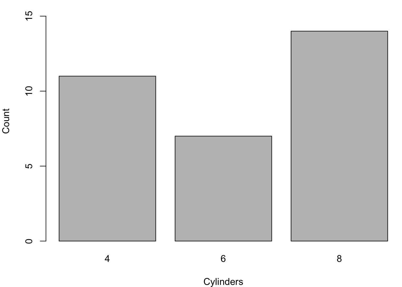
6.5 Boxplot
> boxplot(mtcars$mpg, ylab="MPG", col="lightgray")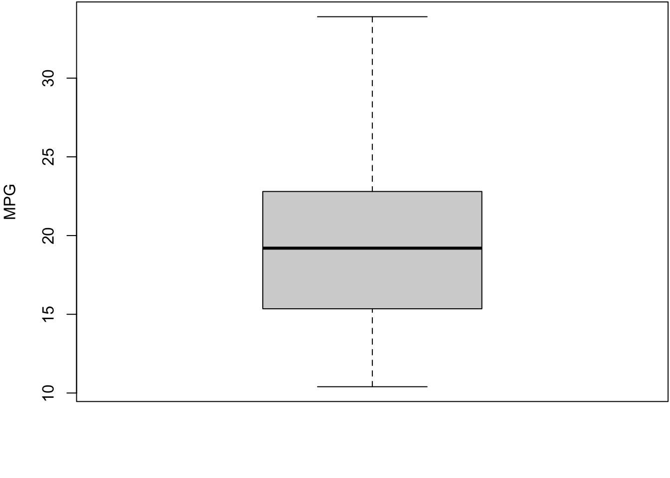
6.6 Constructing Boxplots
- The top of the box is Q3
- The line through the middle of the box is the median
- The bottom of the box is Q1
- The top whisker is the minimum of Q3 + 1.5 \(\times\) IQR or the largest data point
- The bottom whisker is the maximum of Q1 - 1.5 \(\times\) IQR or the smallest data point
- Outliers lie outside of (Q1 - 1.5 \(\times\) IQR) or (Q3 + 1.5 \(\times\) IQR), and they are shown as points
- Outliers are calculated using the
fivenum()function
6.7 Boxplot with Outliers
> boxplot(mtcars$wt, ylab="Weight (1000 lbs)",
+         col="lightgray")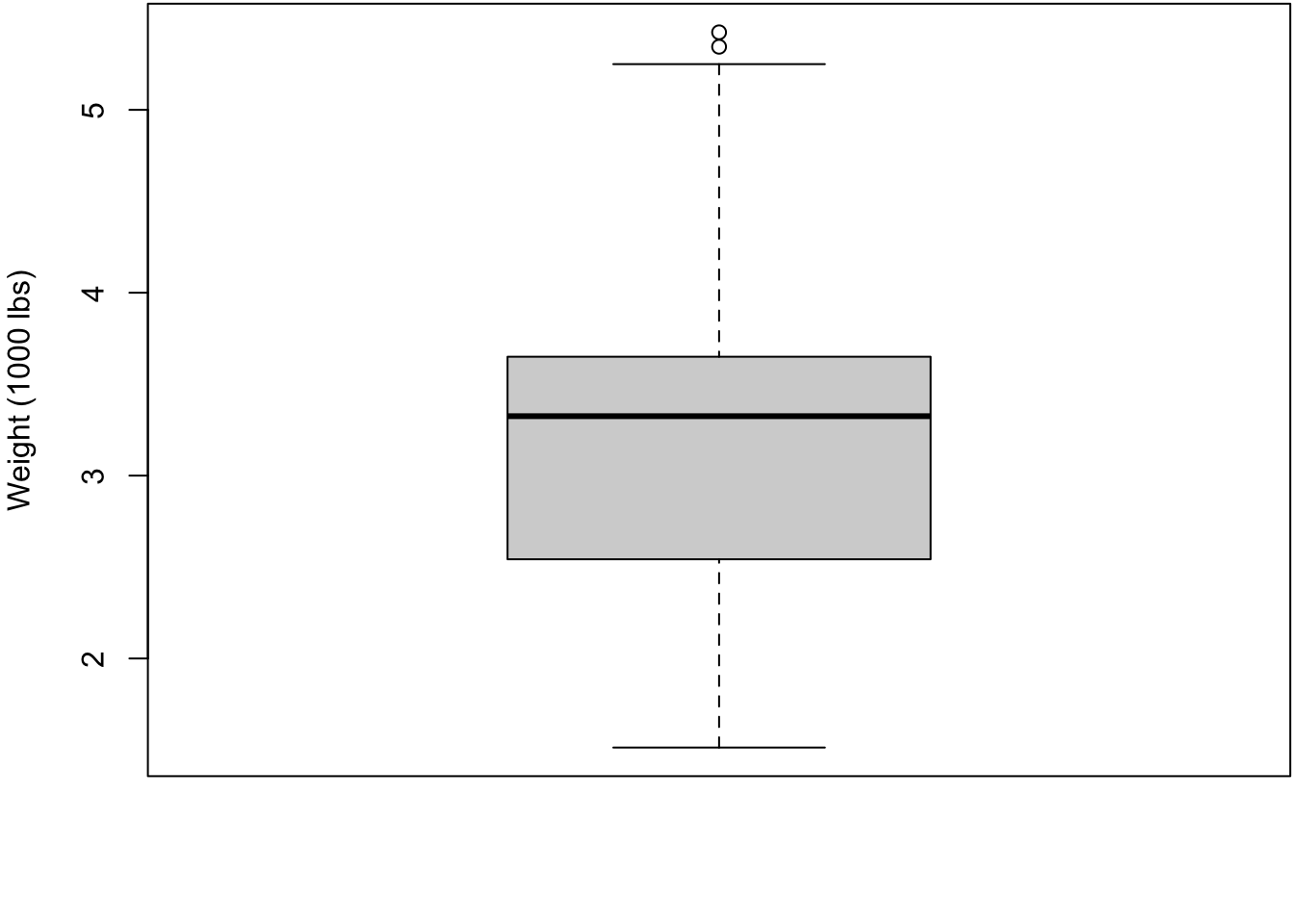
6.8 Histogram
> hist(mtcars$mpg, xlab="MPG", main="", col="lightgray")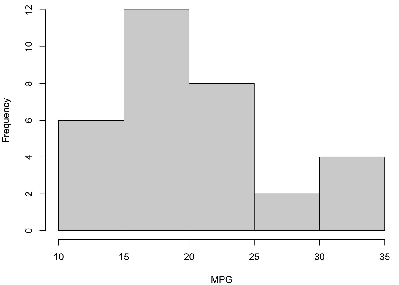
6.9 Histogram with More Breaks
> hist(mtcars$mpg, breaks=12, xlab="MPG", main="", col="lightgray")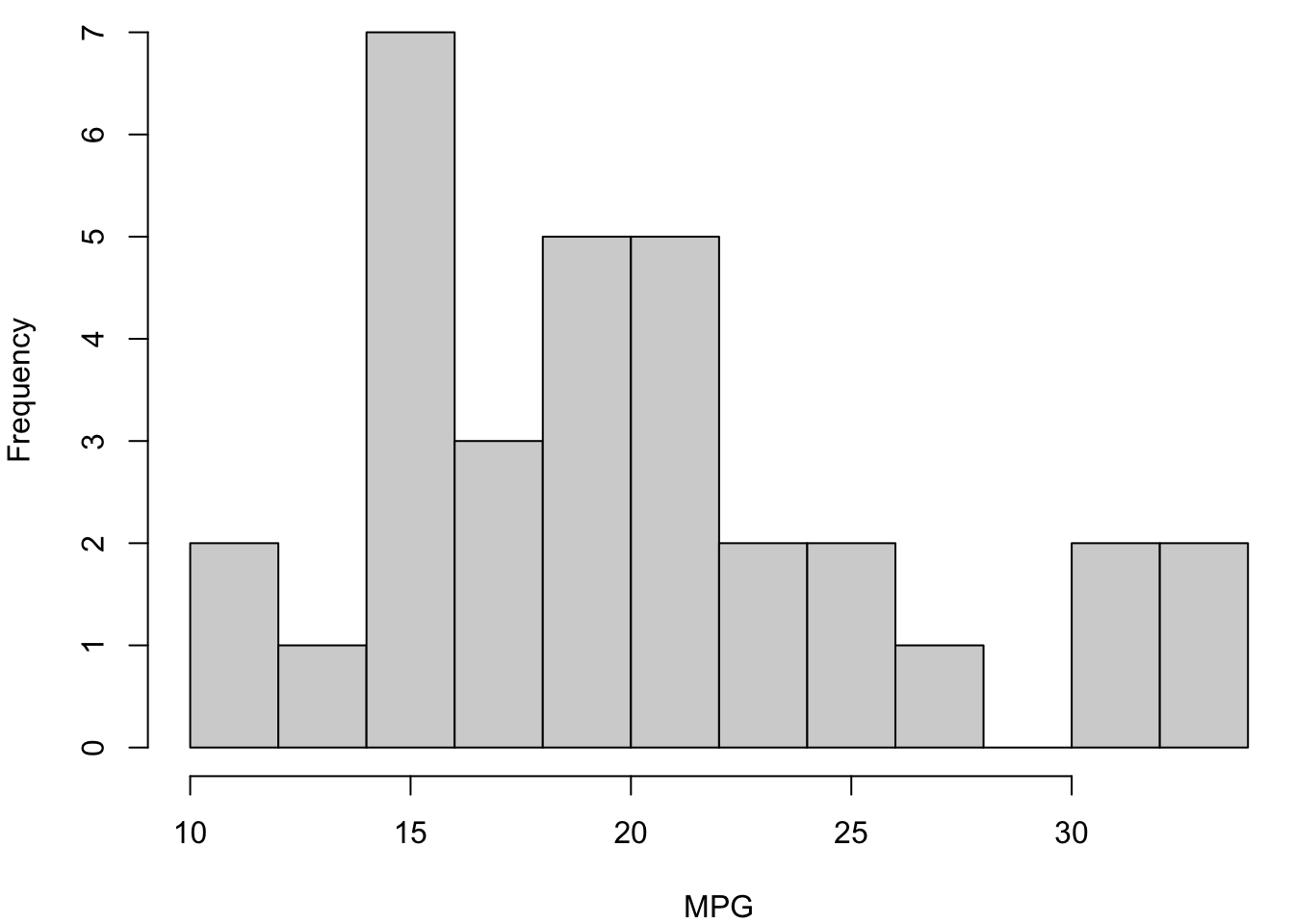
6.10 Density Plot
> plot(density(mtcars$mpg), xlab="MPG", main="")
> polygon(density(mtcars$mpg), col="lightgray", border="black")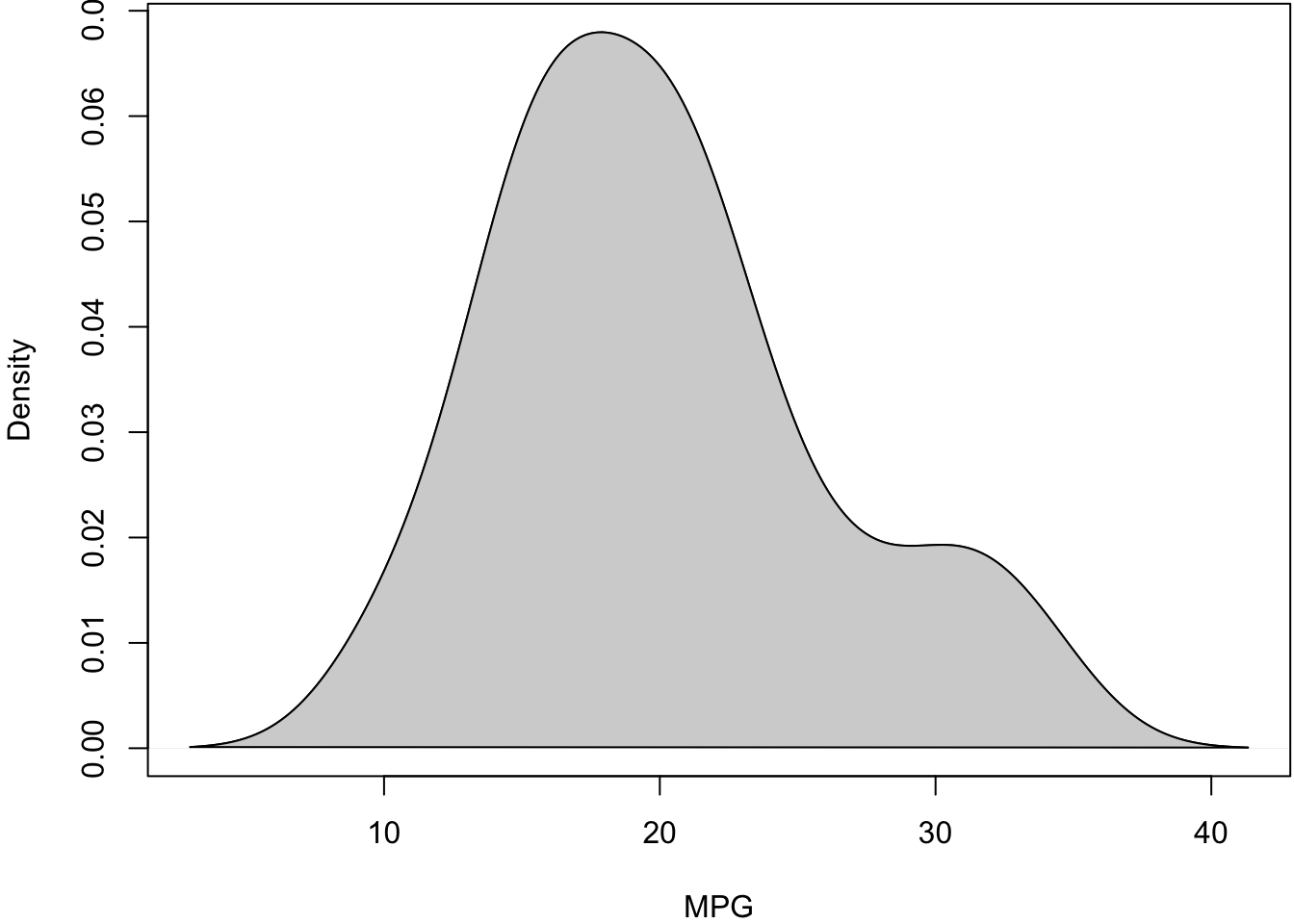
6.11 Boxplot (Side-By-Side)
> boxplot(mpg ~ cyl, data=mtcars, xlab="Cylinders",
+         ylab="MPG", col="lightgray")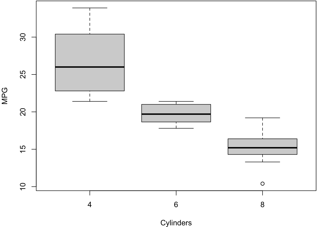
6.12 Stacked Barplot
> counts <- table(mtcars$cyl, mtcars$gear)
> counts

     3  4  5
  4  1  8  2
  6  2  4  1
  8 12  0  2
> barplot(counts, main="Number of Gears and Cylinders",
+ xlab="Gears", col=c("blue","red", "lightgray"))
> legend(x="topright", title="Cyl",
+ legend = rownames(counts),
+ fill = c("blue","red", "lightgray"))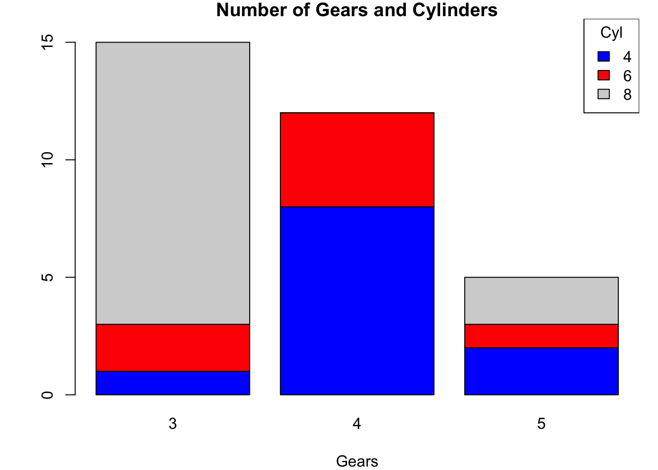
6.13 Scatterplot
> plot(mtcars$wt, mtcars$mpg, xlab="Weight (1000 lbs)",
+      ylab="MPG")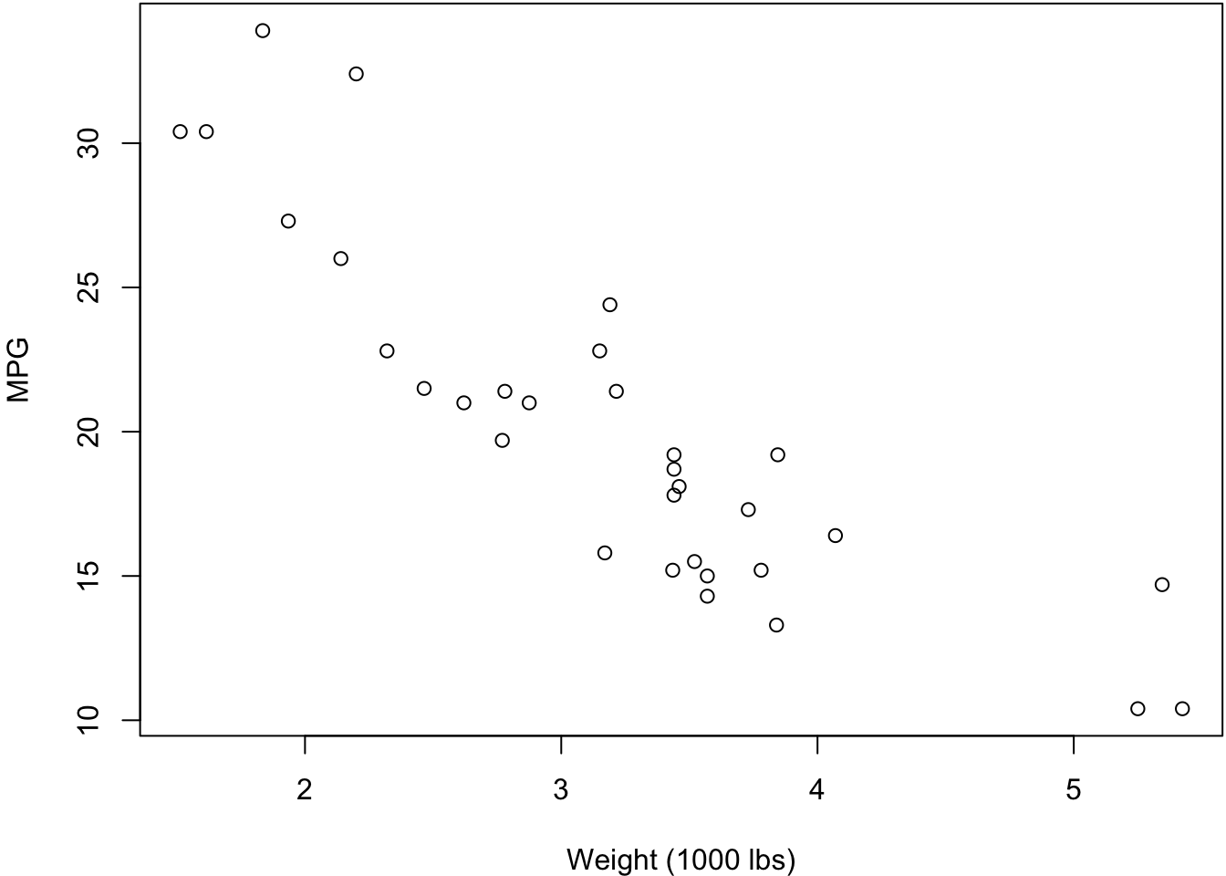
6.14 Quantile-Quantile Plots
Quantile-quantile plots display the quantiles of:
- two samples of data
- a sample of data vs a theoretical distribution
The first type allows one to assess how similar the distributions are of two samples of data.
The second allows one to assess how similar a sample of data is to a theoretical distribution (often Normal with mean 0 and standard deviation 1).
> qqnorm(mtcars$mpg, main=" ")
> qqline(mtcars$mpg) # line through Q1 and Q3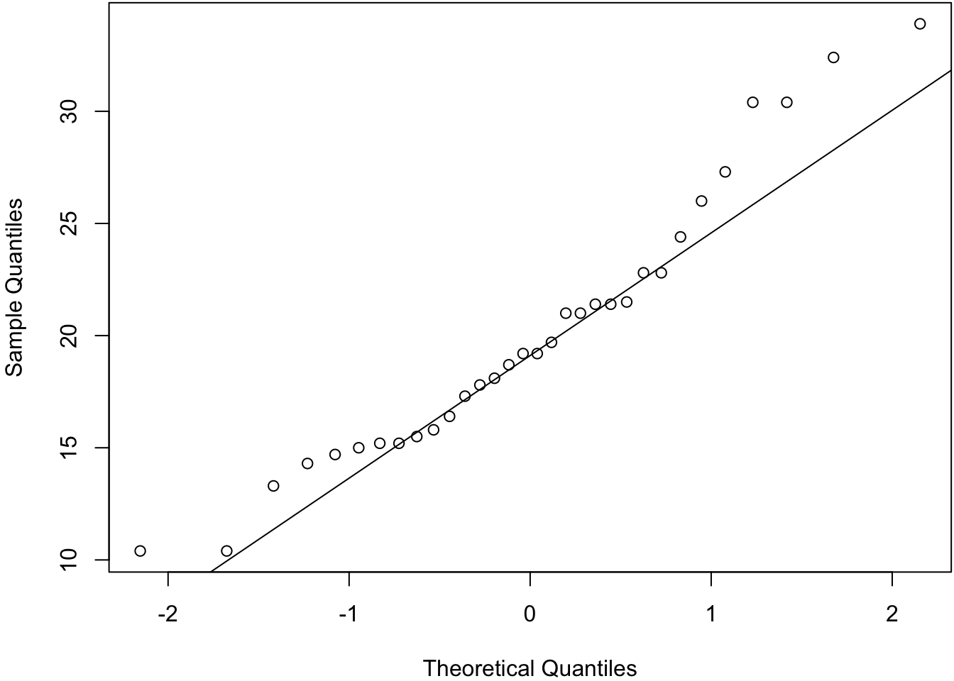
> before1980 <- gapminder %>% filter(year < 1980) %>%
+   select(lifeExp) %>% unlist()
> after1980 <- gapminder %>% filter(year > 1980) %>%
+   select(lifeExp) %>% unlist()
> qqplot(before1980, after1980); abline(0,1)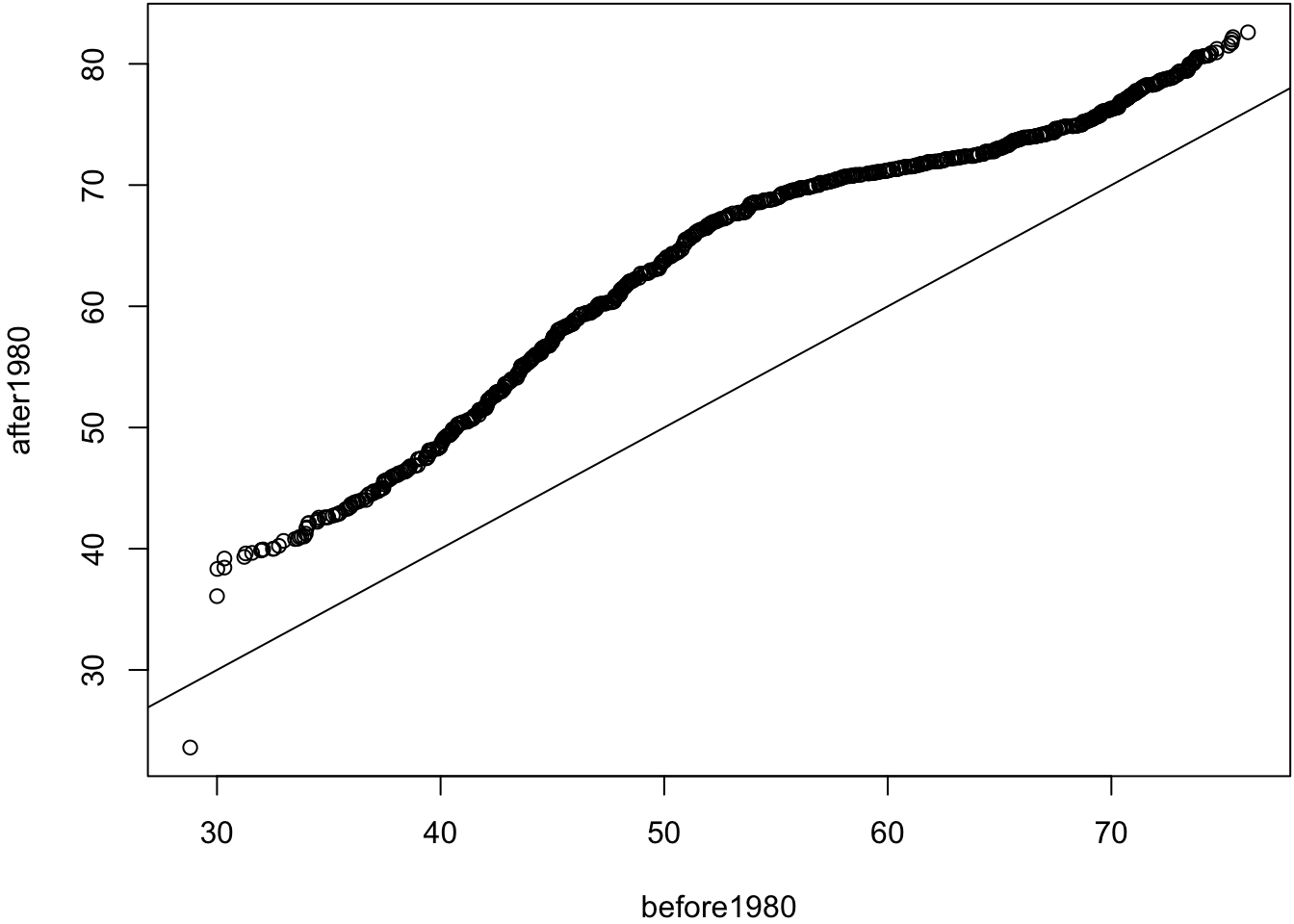
> ggplot(mtcars) + stat_qq(aes(sample = mpg))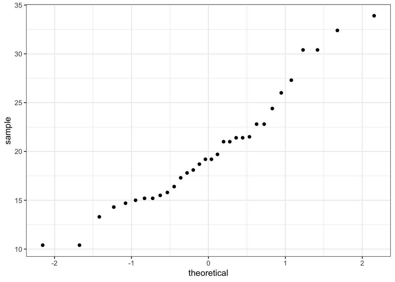
> ggplot(gapminder) + stat_qq(aes(sample=lifeExp))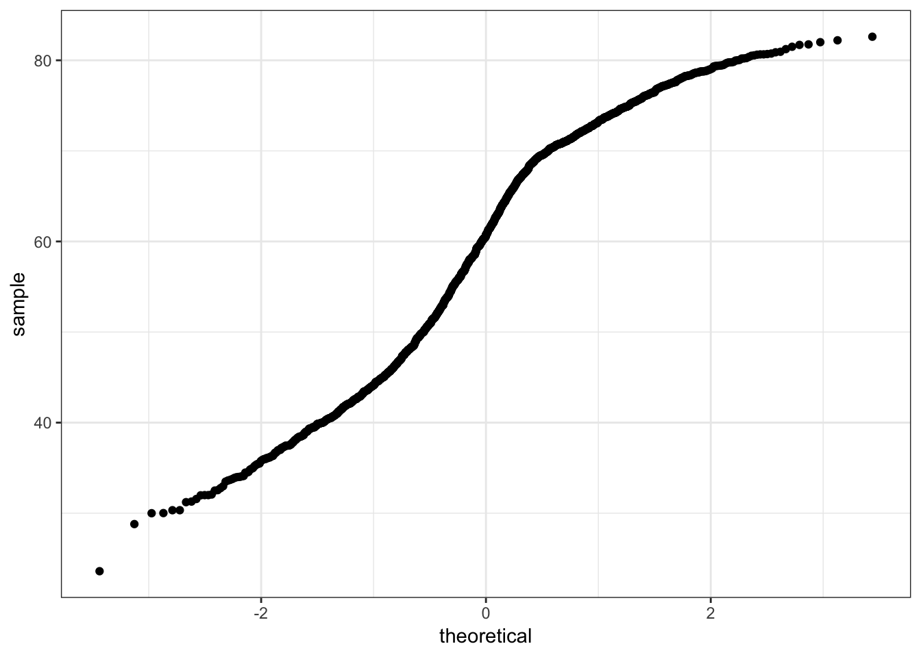
> ggplot(gapminder) +
+   stat_qq(aes(sample=lifeExp, color=continent))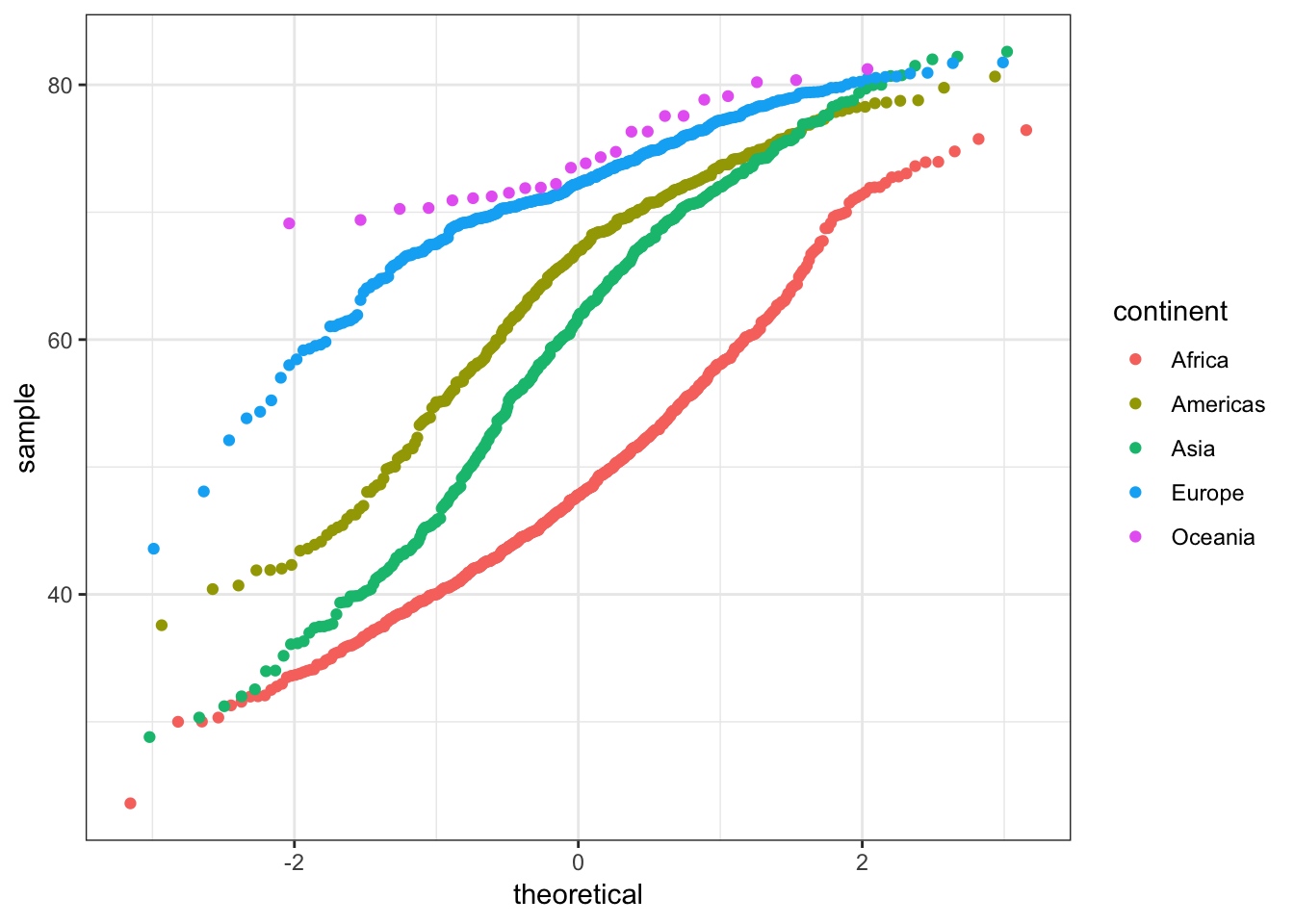
6.15 A Grammar of Graphics
There are many advanced graphics packages and extensions of R. One popular example is ggplot2, which is a grammar based graphics framework. An introduction to ggplot2 is provided in (YARP, Yet Another R Primer)[https://jdstorey.org/yarp/a-grammar-of-graphics.html].